Design work
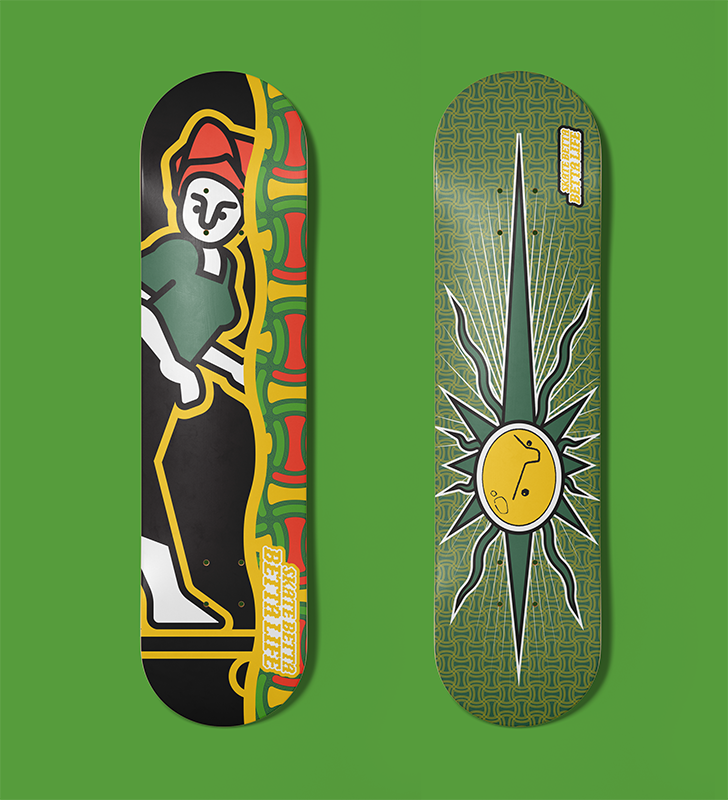
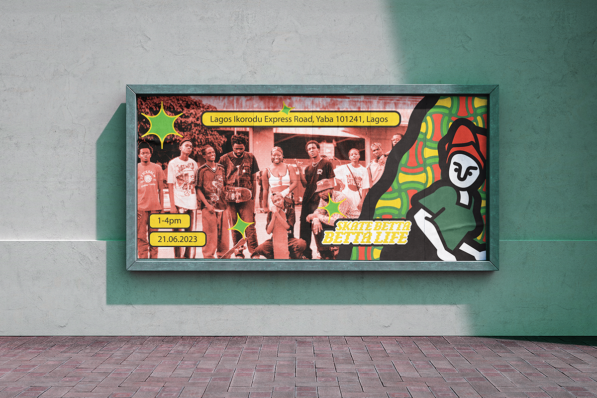
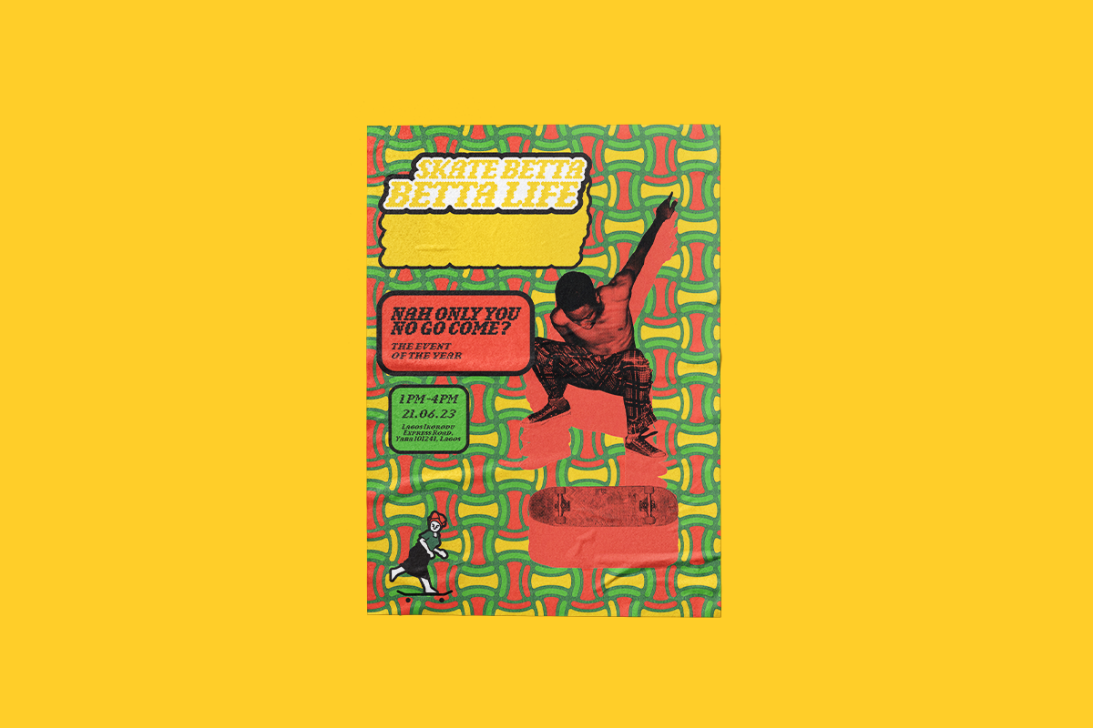
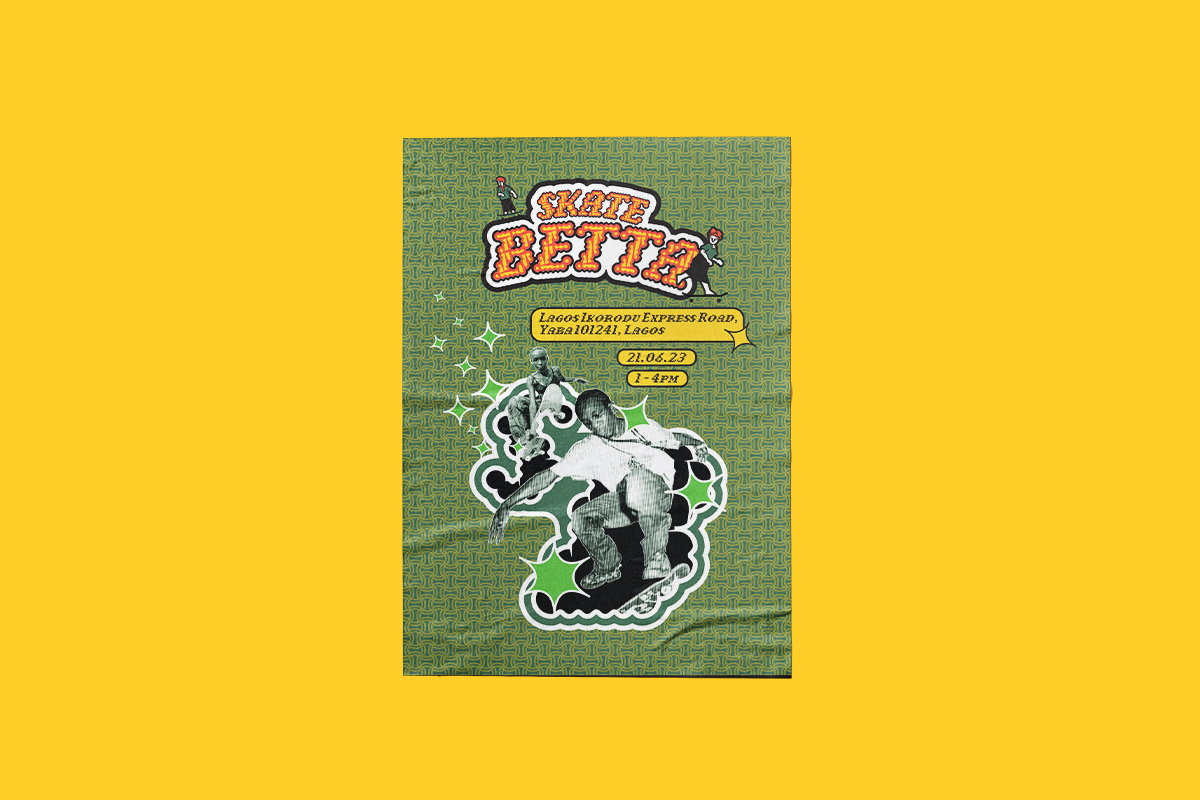
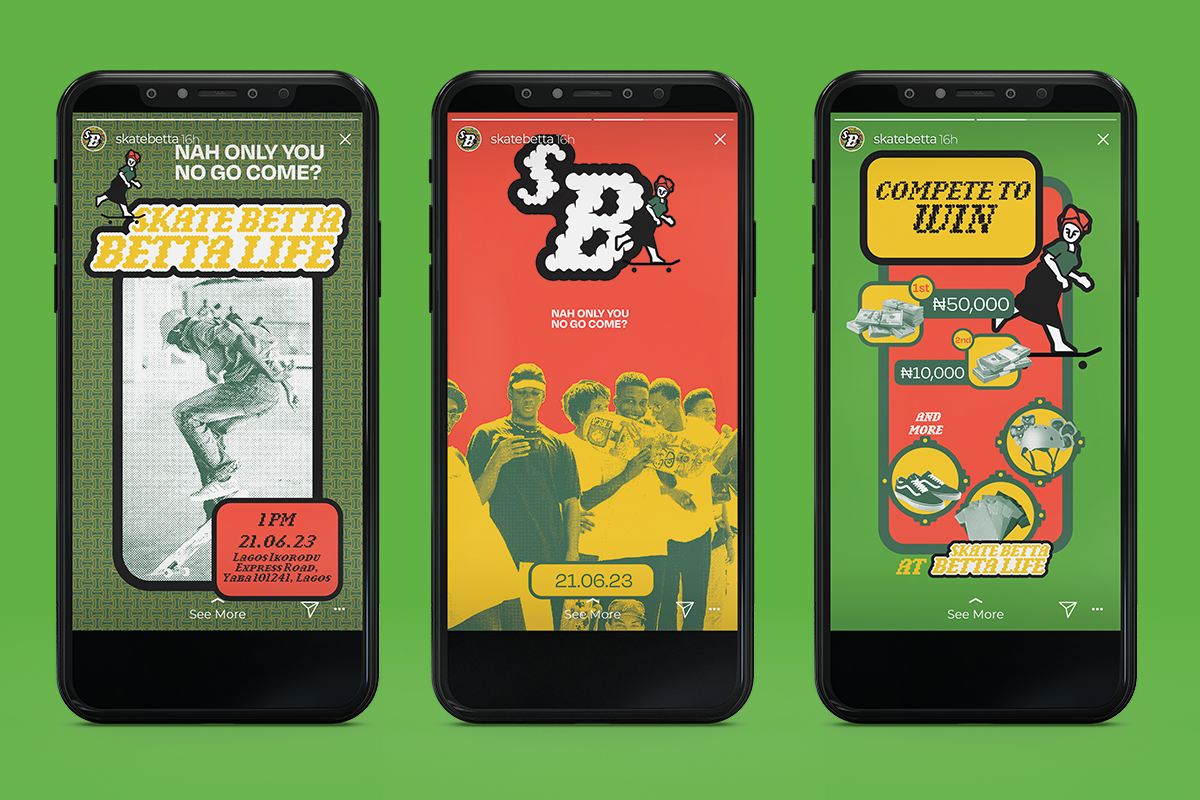
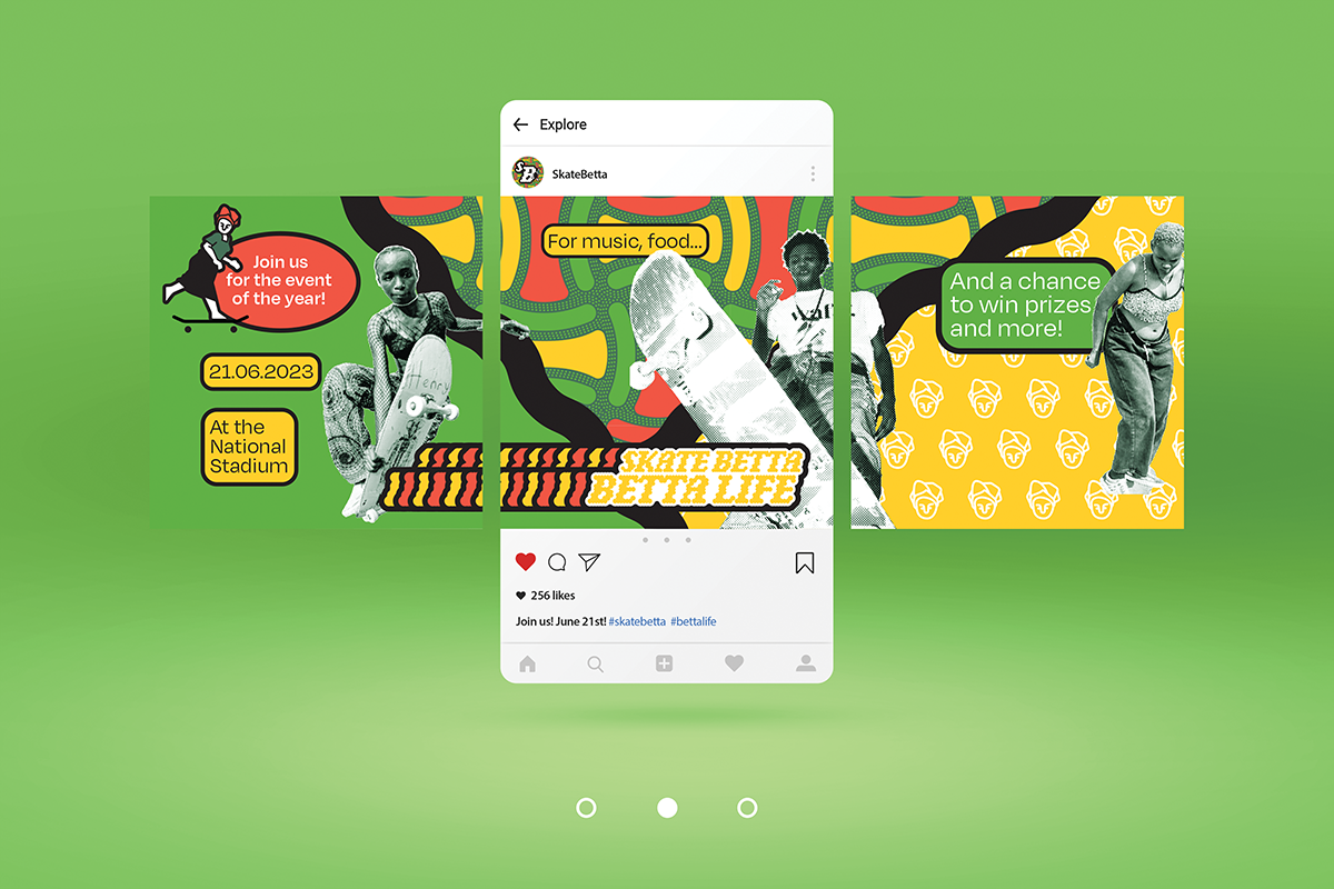
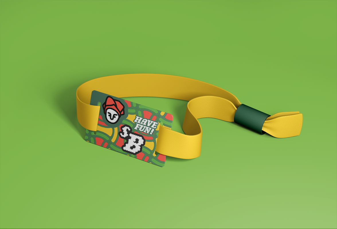
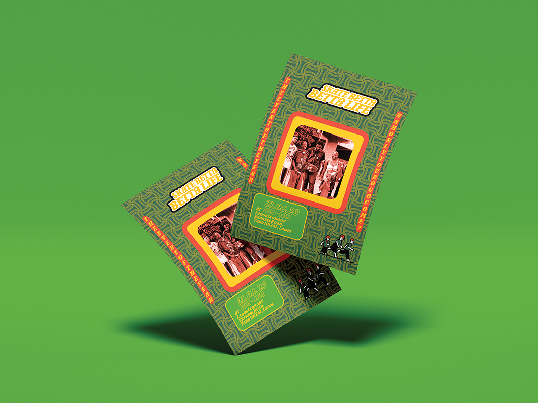
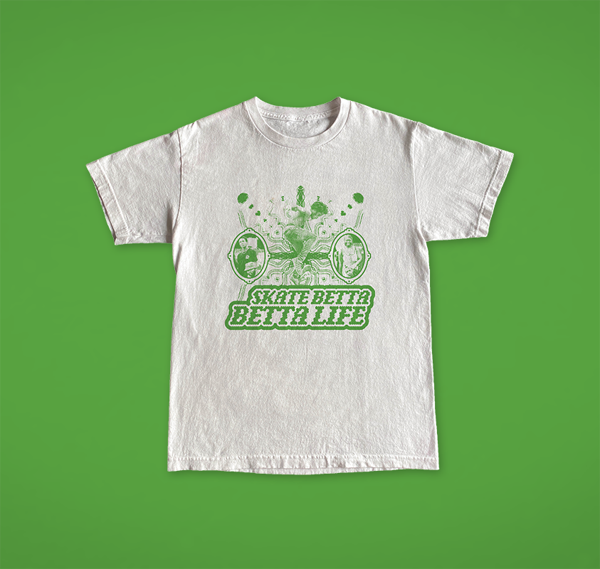
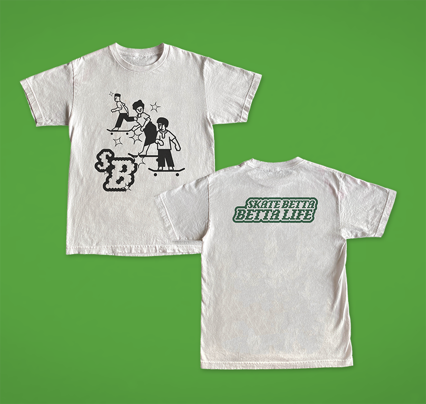
Skate Betta, Betta Life
Skate Betta, Betta Life is a festival centred around Nigerian skate culture. Since 2016, over three communities have been formed, one even opening the first Skate shop in Lagos Nigeria. The festival uses imagery that has significance in Nigeria's culture; green, the brand's main colour, is the main colour on the Nigerian flag; and the patterns were inspired by Ankara (patterned textiles that are sewn into clothes). The outcome is a festival identity that combines aspects of Nigerian culture with modern skate culture, which results in a vibrant and visually engaging festival collateral and identity.
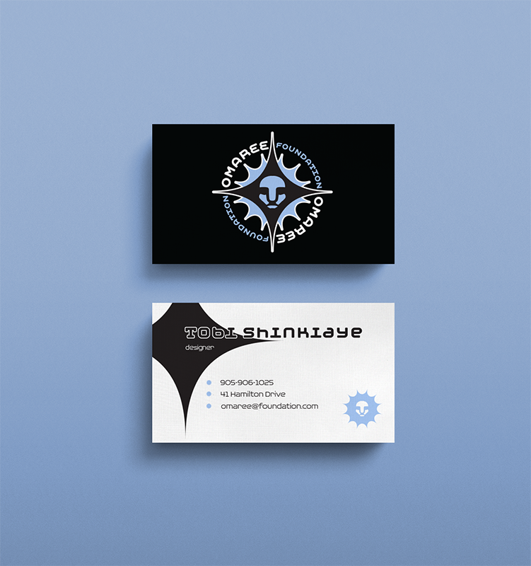
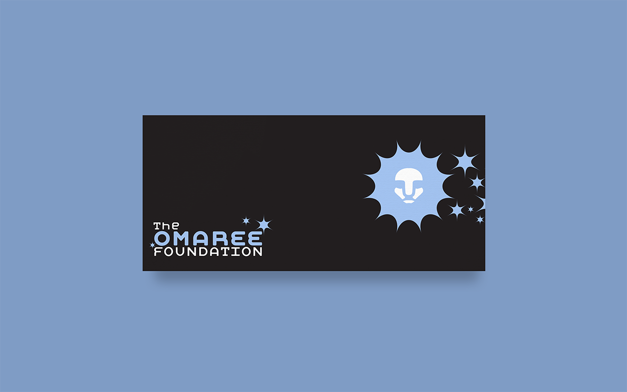
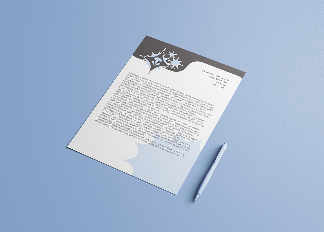
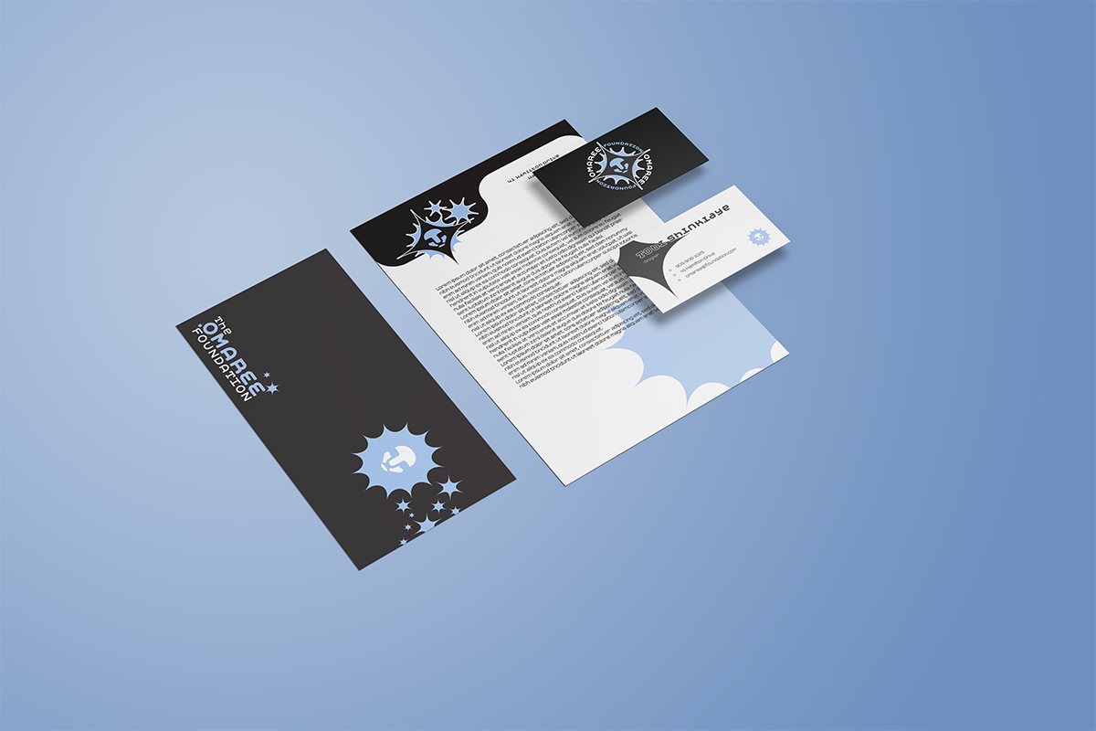
The Omaree Foundation
A brand identity for a non-profit organization focused on exhibiting up-and-coming artists from all over the world. The brand is mature enough to appeal to an older audience, such as veteran artists and investors, but also appeals to younger artists.
The star imagery and bright colours make the brand visually engaging and the bold serif fonts adds an air of maturity to the brand.
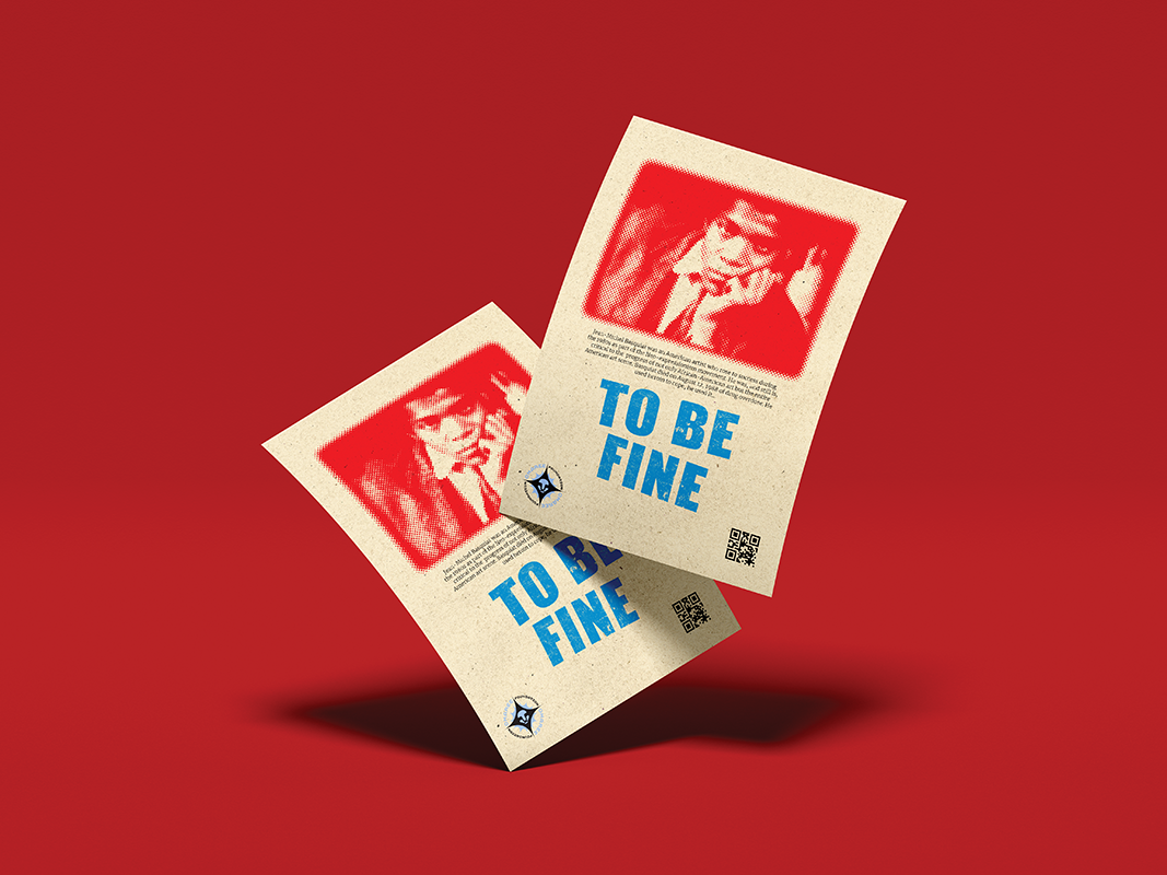
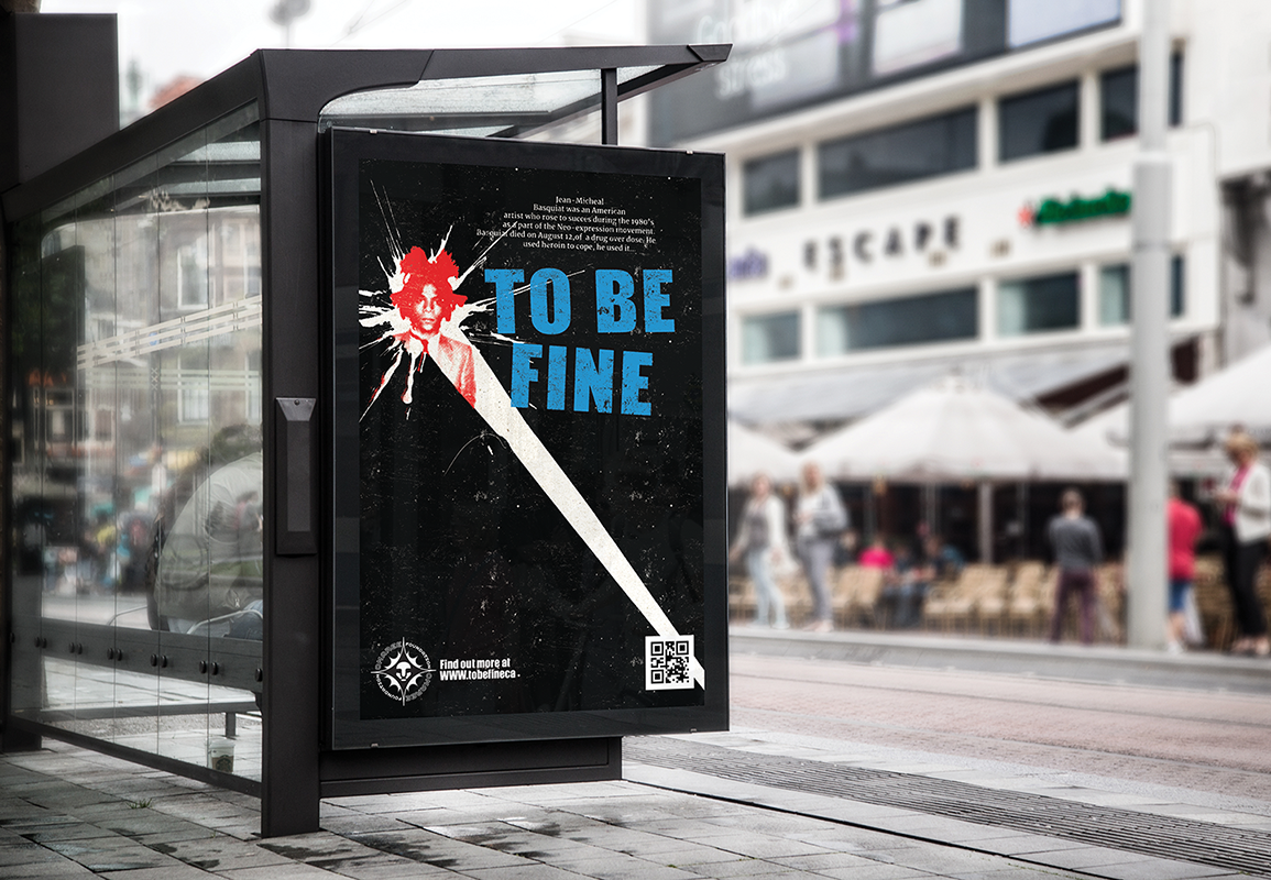
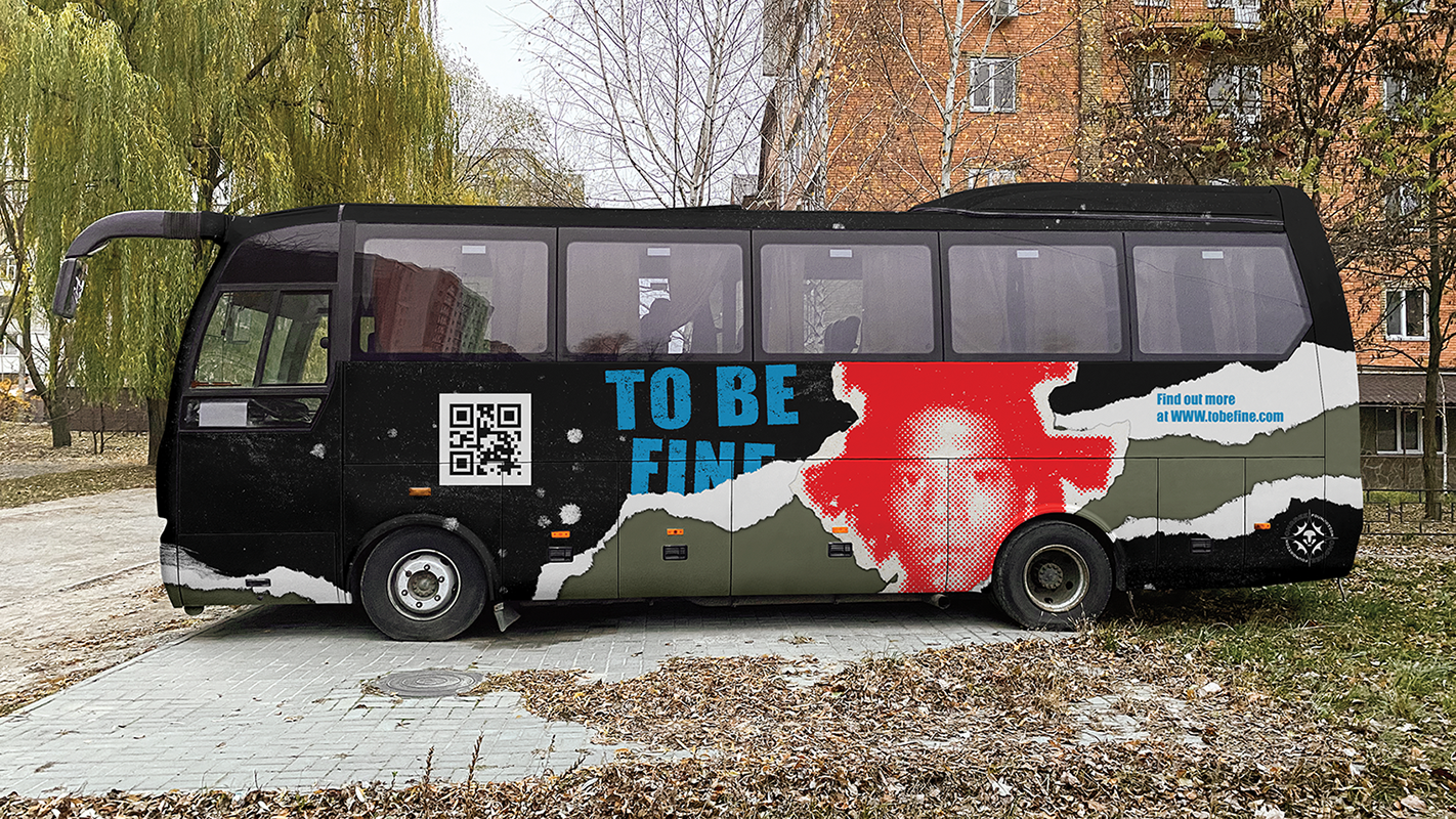
To Be Fine
Campaign design for The Omaree Foundation. The campaign focuses on spreading awareness of substance-abuse, educating people on the long-term and short-term effects of various substances rather than demonizing them. Jean-Michel Basquiat, a famous artist that lost his life to substance abuse, was chosen as the face of the campaign. Putting a face to the issue humanizes it, making the campaign more approachable. The gritty textured look is taken form anti-drug ads from the early 2000s. The campaign maintains the seriousness of such a topic while remaining approachable.

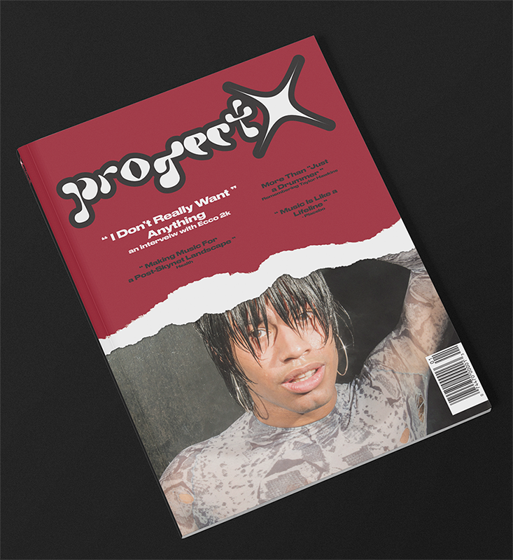
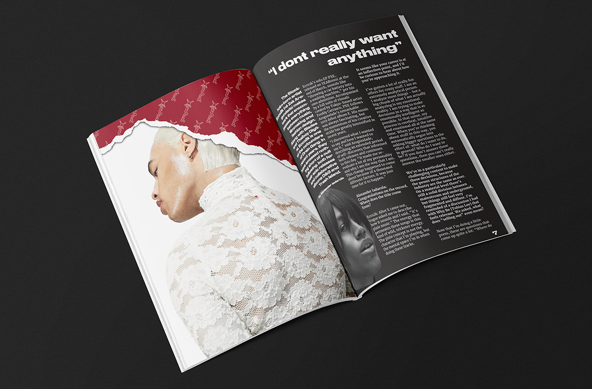
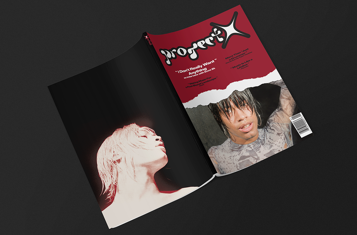
Project X
Revitalizing Project X, a retired alternative magazine focusing on scene life in the early 2000s. The new magazine would focus on current alternative culture, targeting today's teens and young adults. The new Masthead uses the Petal font (by Pétalla Menezes), a futuristic font fitting the Y2K futurism aesthetic popular in the early 2000s, seeing as it's made a comeback in recent times. The new look varies a lot from the former, pulling inspiration from the alternative culture of the 2020s, choosing to carry on the brand in content alone. With a fresh modern look, both alternative and appealing, Project X is ready for the market.
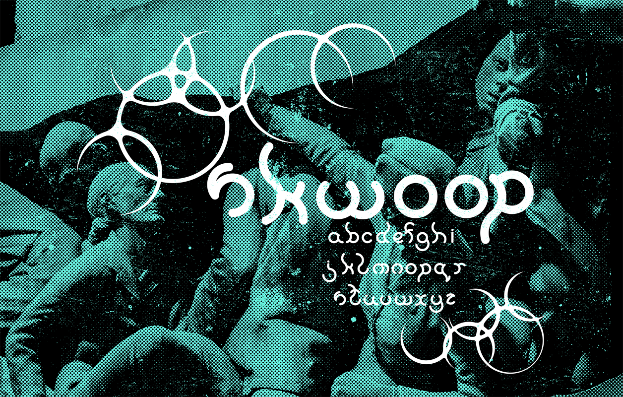
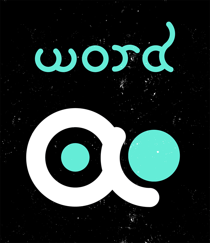
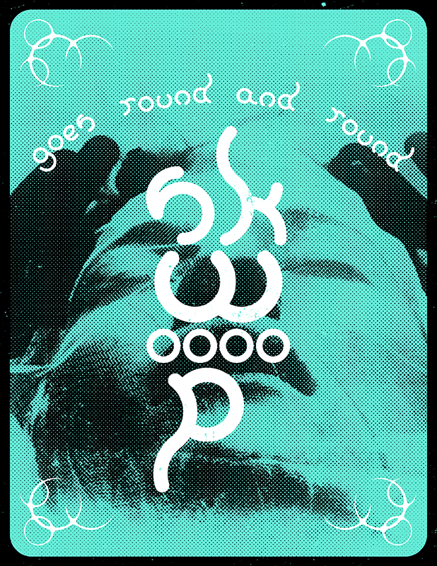
Skwoop
A geometrical font made up of only circles. Constructed from sections of 1 and 1.5-inch circles, stacking curves to form longer stems on ascenders and descenders. The result is visually engaging font, each letter having its own unique movement.

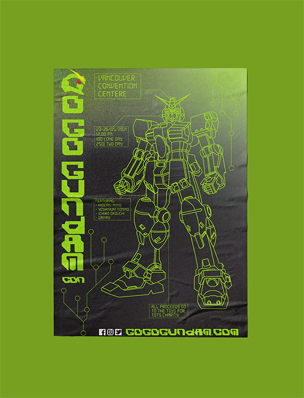
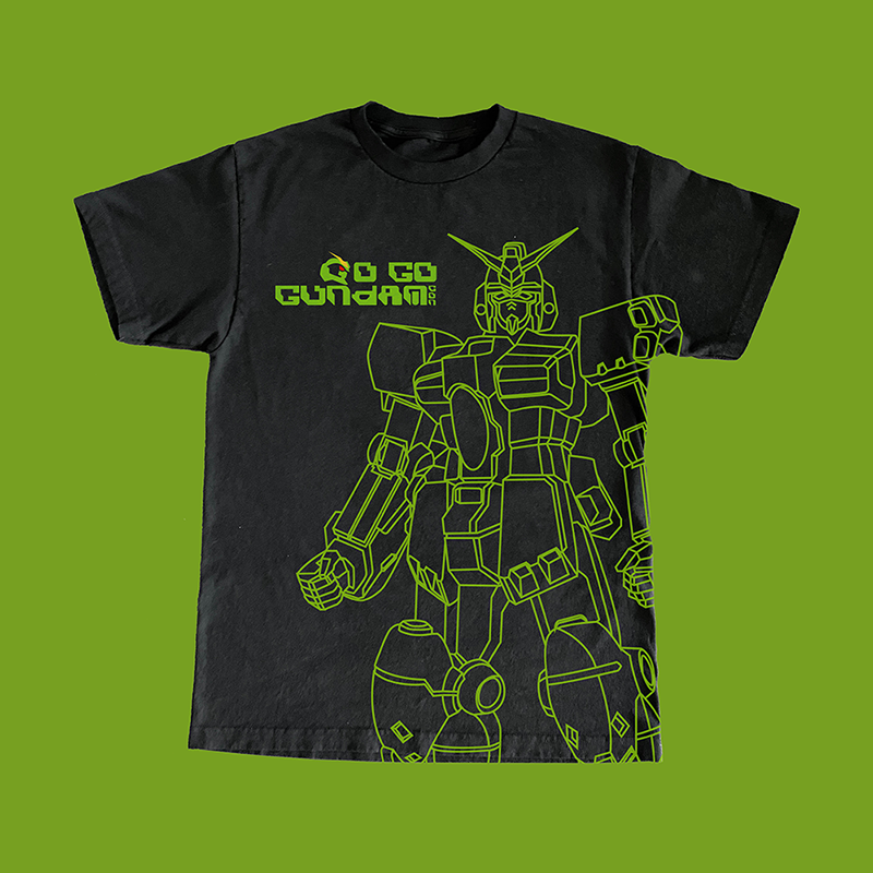
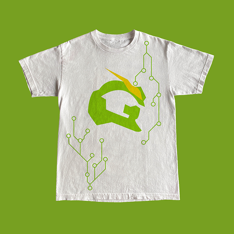
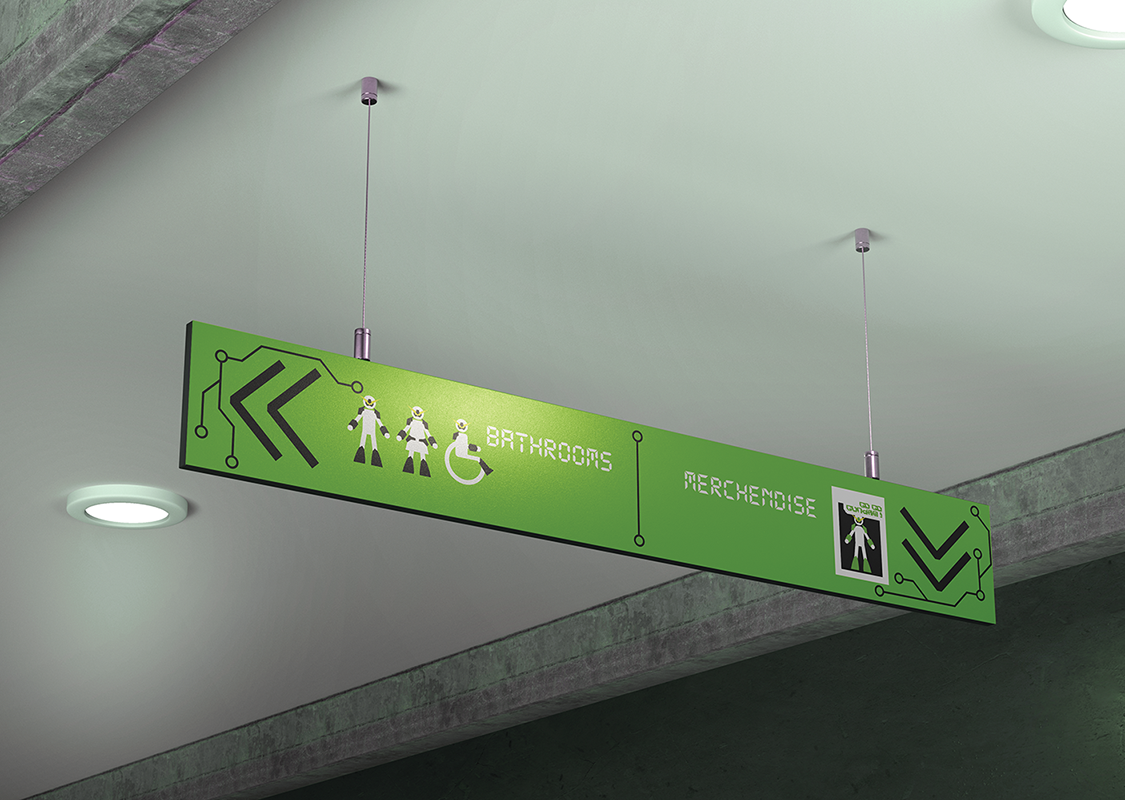
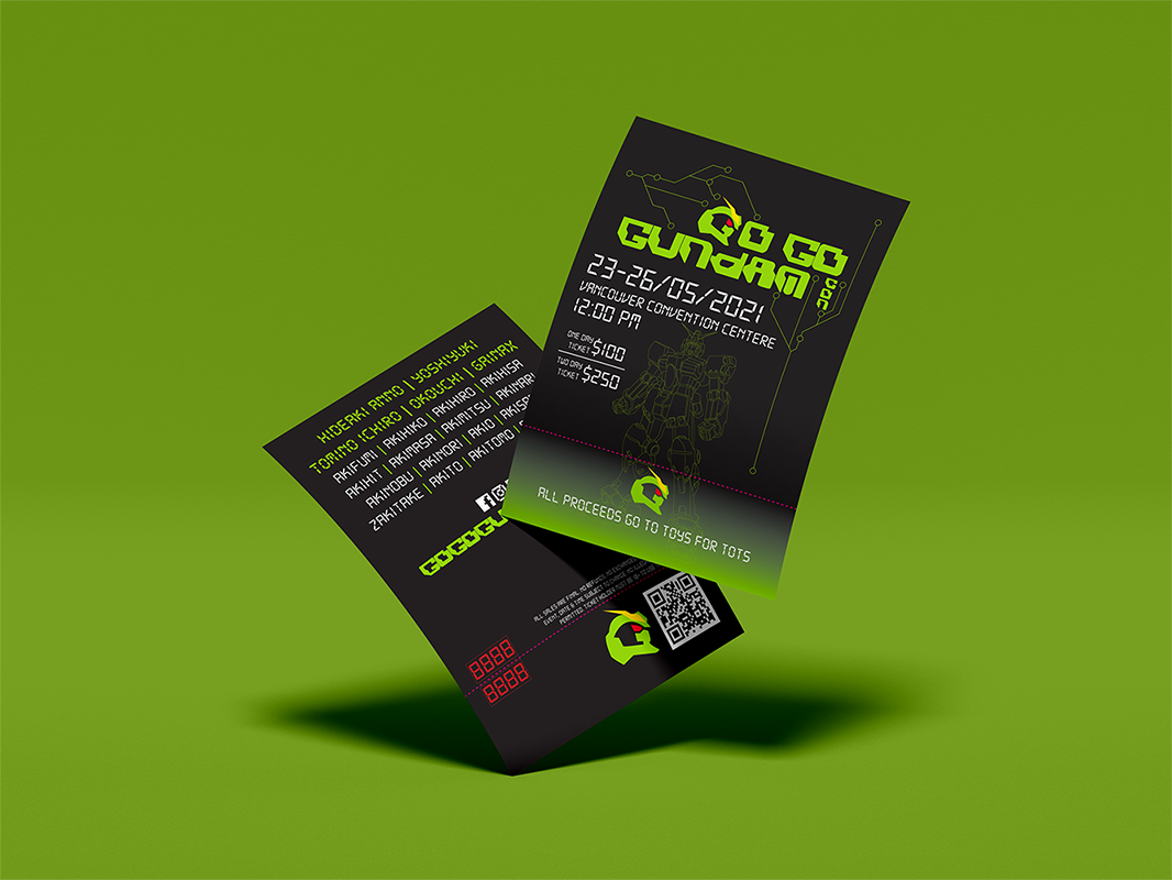
Go Go Gundam
Event Design for a Mecha Themed Convention for anime fans. Referencing the Gundam series (a popular franchise in the genre), combining its imagery with the conventions identity. Taking inspiration from analog technology, Go Go Gundam's look uses a bright green on dark backgrounds, as well as circuitry pattern across the collateral. The conventions look remains unique while referencing existing works, resulting in a dark abstract-tech aesthetic.
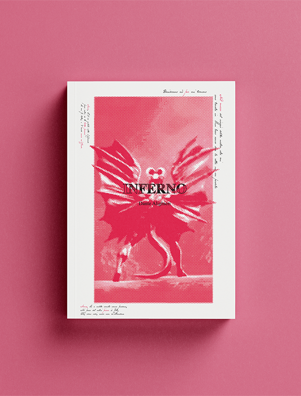
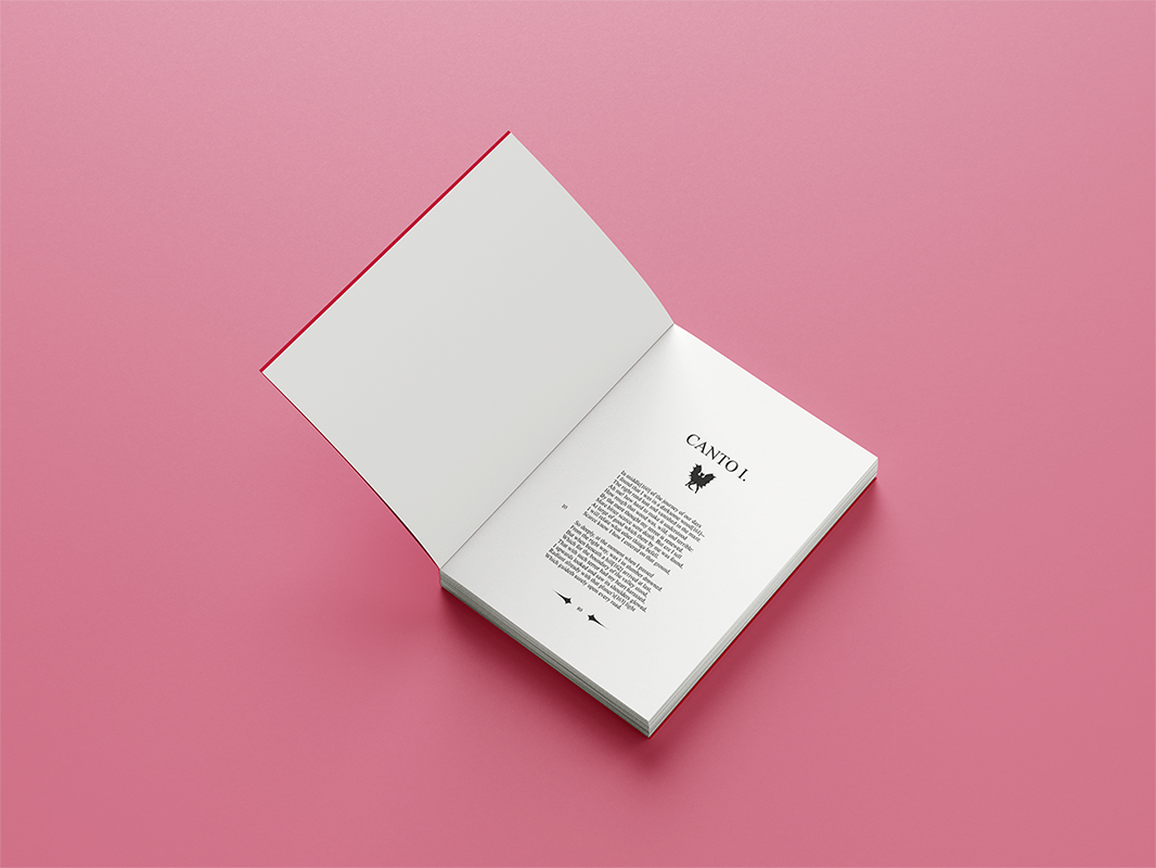
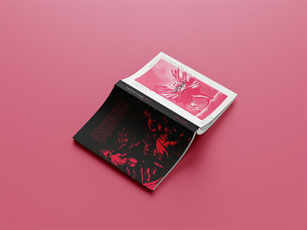
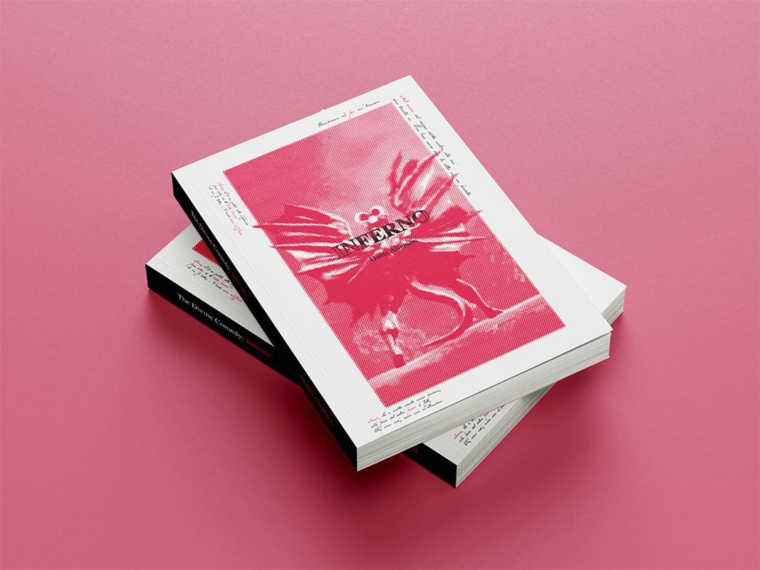
The Divine Comedy: Inferno
A Redesign of the first Volume of the Divine Comedy, Inferno, for new readers as well as fans of classical literature. The cover depicts satan with his back turned and wings out watching over the ninth circle of hell, and for a moment, Dante’s journey. The back of the depicts a scene in the book: Dante and Virgil crossing over the river Styx. The cover includes references for existing fans and looks appealing to those not familiar with the story.